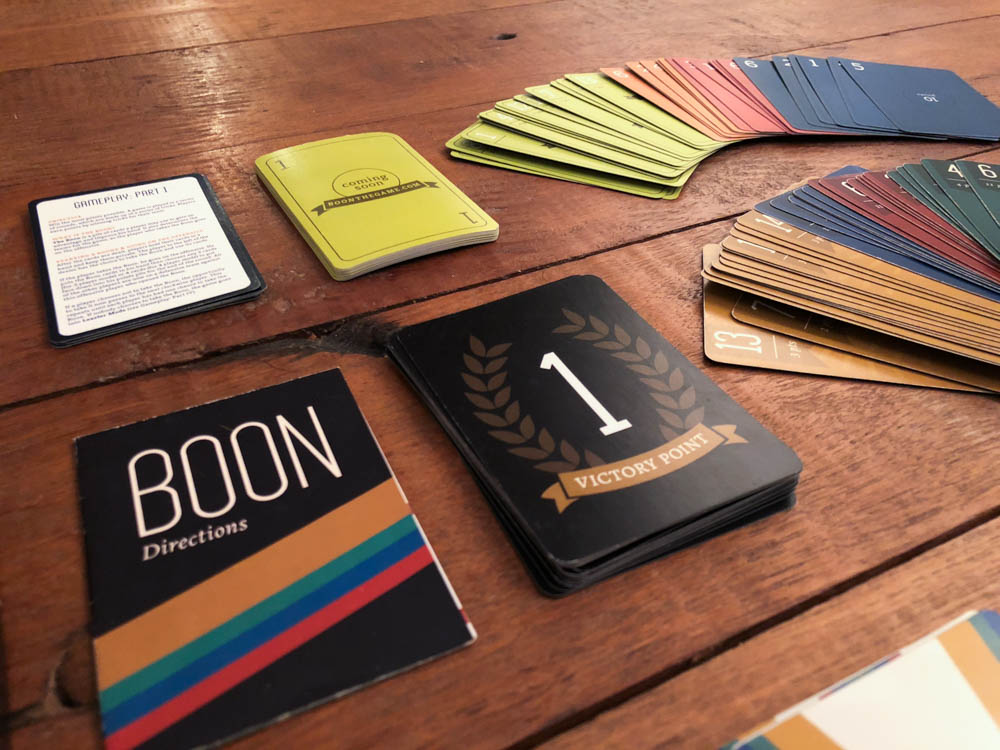
Designing a card game, usability testing, video editing, and more
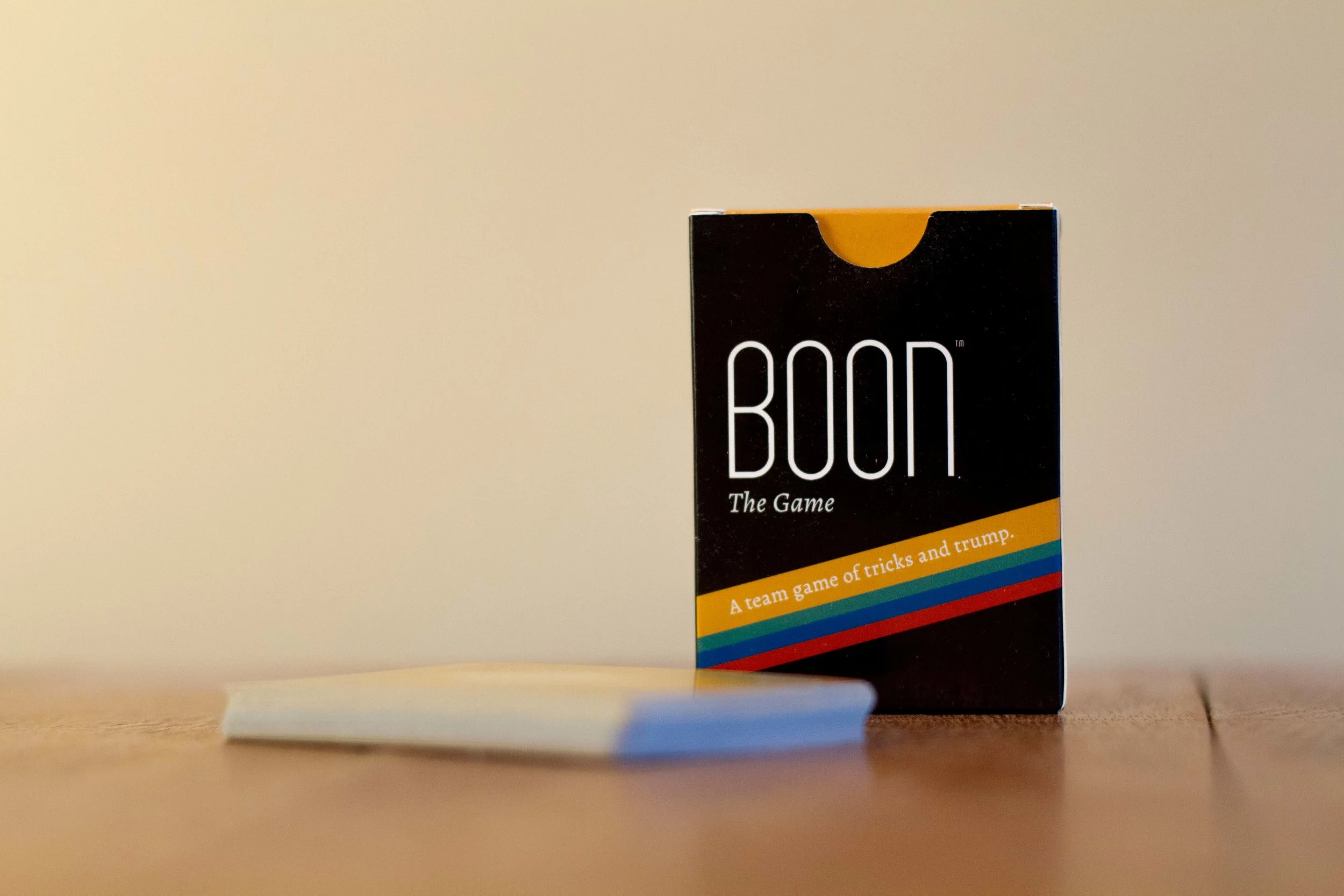
Boon: The Game is for sale at www.boonthegame.com
Skills
Collaboration with business partner (a web developer)
Design and print prototypes
Conduct usability tests — gather user feedback through play-testing
Iterate on designs based on feedback
Write instructional copy
Create a video (writing, directing, producing, filming, editing, animating, voice-over, Adobe Premiere Pro, Adobe After Effects)
Social media marketing
Design a website
Work with a printer
Sell the game
Host live events
2015
Overview
Objective
Make the classic card game sheepshead easier to learn than it is on a standard deck of cards, and launch it to a wider audience than sheepshead, which is typically played by an older crowd in Wisconsin and Germany. Do this by designing a custom deck of cards that appeals to a younger audience, writing directions to be easily understood by new players, conducting usability tests, iterating on designs, and successfully bringing the game to market.
Context
Sheepshead is traditionally difficult to learn and mostly played by older audiences. By putting the points right on the cards, for instance, we could simplify and allow players to focus on strategy.
Outcome
Though many iterations, we successfully made a more modern version of the game. Kids through adults play the around the world, and we have sold nearly 400 decks.
Problem
Sheepshead is a classic card game — similar to Hearts, Spades or Euchre — that is played on a standard deck of cards. It is difficult to learn, as each card has a different point value with seemingly no rhyme or reason, and the “trump” suit is unclear. My partner and I wanted to make a deck of cards following the rules of sheepshead, but a custom one that is easier and quicker to learn.
Users and Audience
Sheepshead’s typical audience is older folks who have been playing for years. Rather than try to change the habits of seasoned players, we decided to target the millennial audience, introducing them to the game for the first time. The game is also most prevalent in Wisconsin and Germany, but we decided to widen the audience by targeting all U.S. states (we stuck with the U.S. for shipping purposes).
My Role
I was co-creator of the game, responsible for designing the website and cards, writing instructions, co-organizing play-testing, directing and editing an instructional video, managing social media accounts, planning a launch party, and more. My partner was responsible for developing the website based on my design, helping to organize play-testing, managing finances, and handling the legal aspects.
Constraints
Limited time: While we began brainstorming and designing the game in July or so, we wanted to have it ready to sell at a launch party in early November, just in time for the holiday season. While this sounds like a lot of time, designing, play-testing and printing a new prototype deck took a great deal of time to execute.
Limited finances: We were bootstrapping the project and had a limited budget.
Small team: There were only two of us so we had to wear many hats.
Printer: The printer was located in China; since we were in different time zones, email communication took days, and printing and shipping took a week or two – we often had to pay extra for express shipping.
Design Process
The idea came about because my business partner wanted to build and publish a mobile app for sheepshead, his favorite game. We decided to create a draft of physical cards and play with those to determine if our suit and numbering system was accurate for the app. Thus, we began by brainstorming our own suit and numbering system for the game. Ultimately, we liked the idea of pursuing the card game rather than the app.
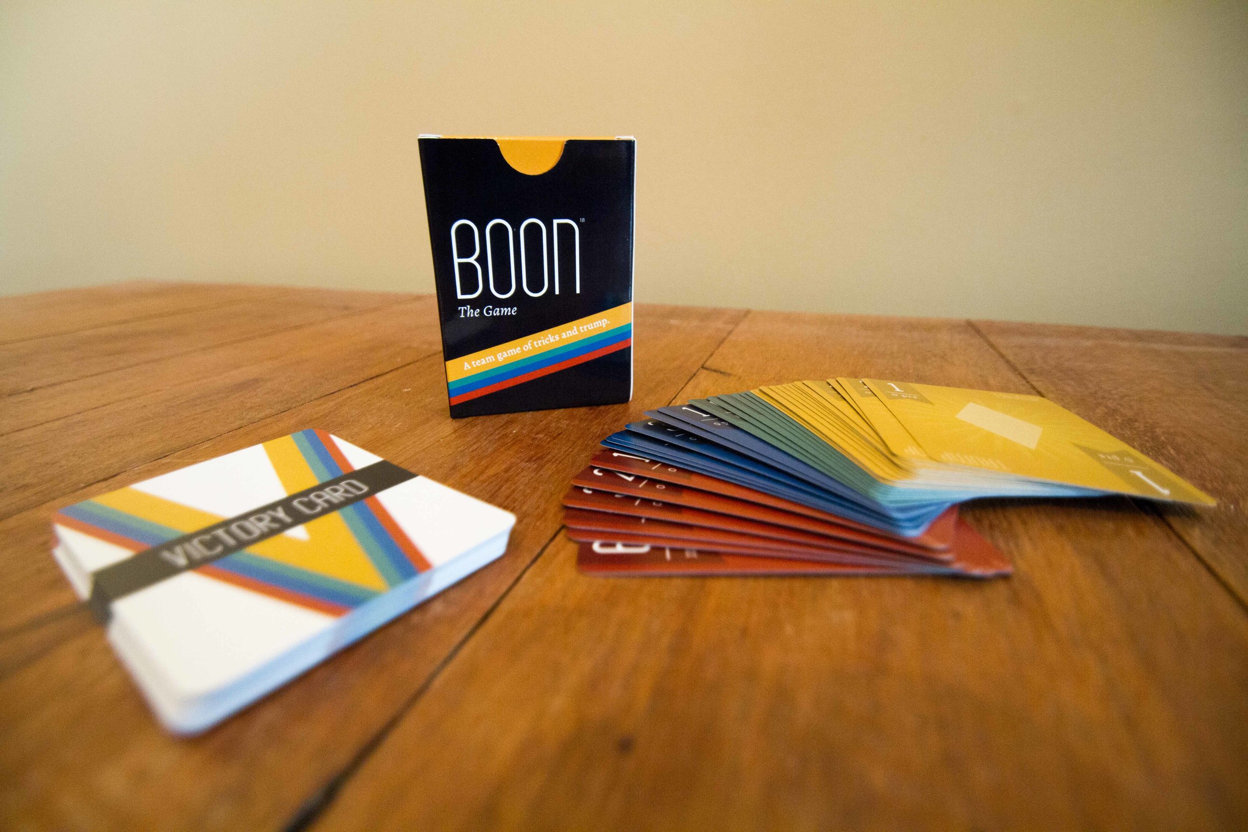
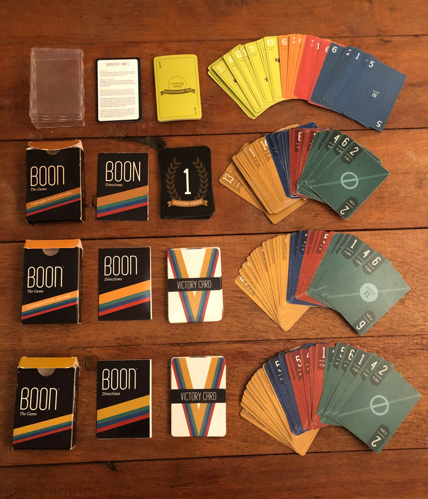
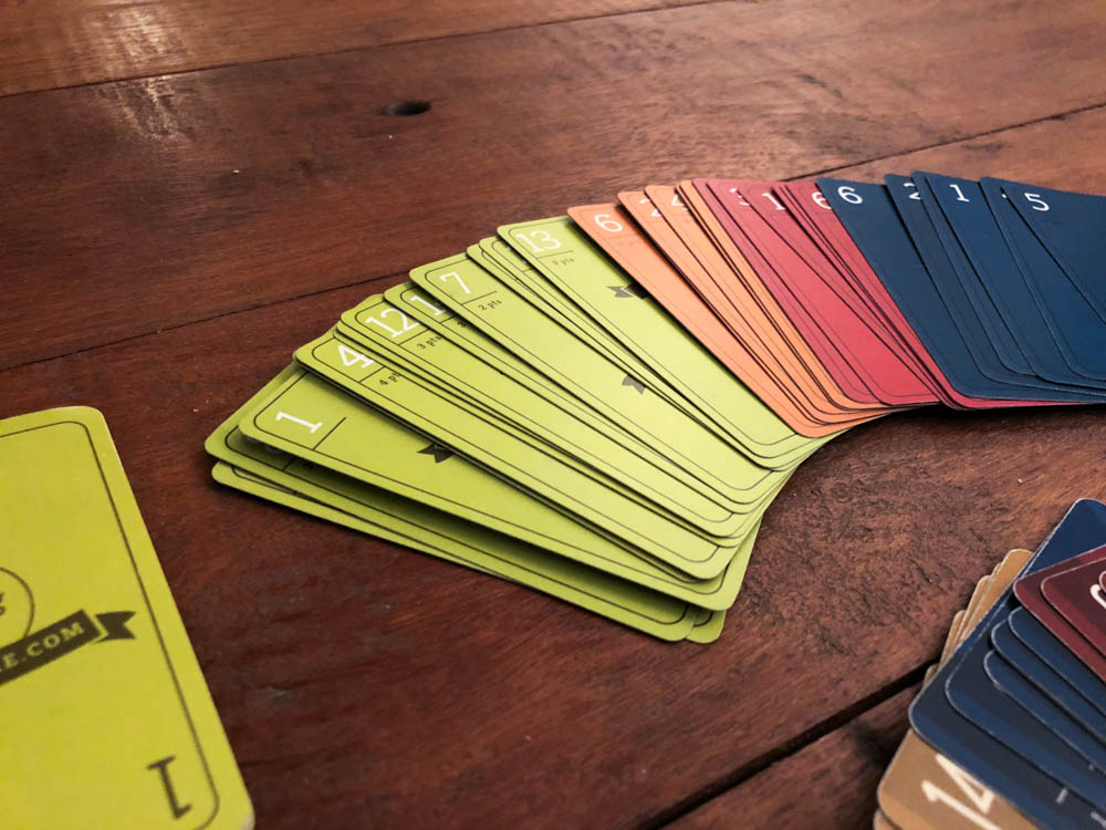
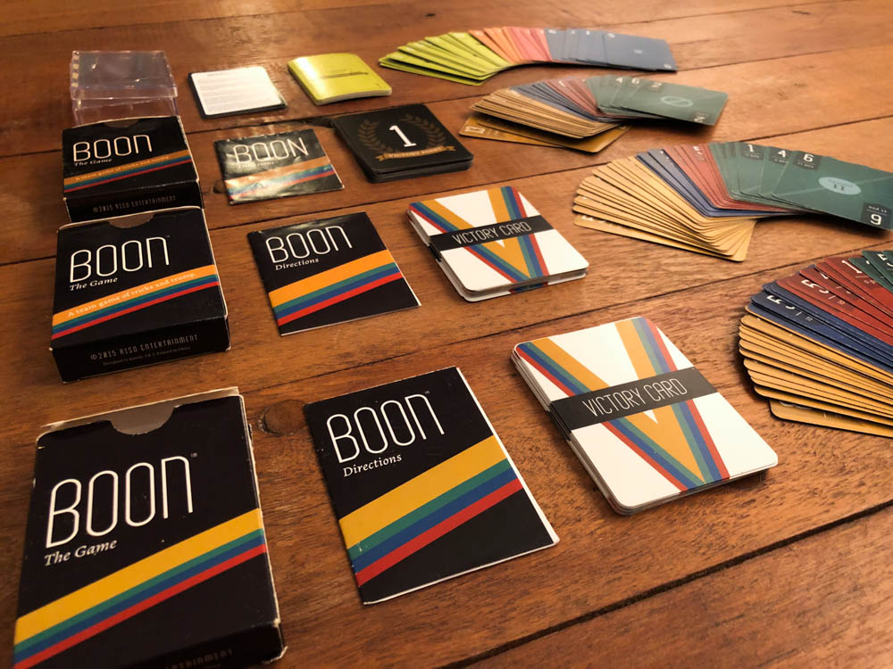
I wrote directions and designed a sample deck. I designed each suit as a different color, including an entire suit dedicated to the “trump” cards. We also included point values on the cards. These two features were key to our game so players didn’t have to memorize the “trump” cards or the complicated points system, as you do with sheepshead.
We printed the prototype and directions, then play-tested this deck with some potential users, and gathered feedback about the design. Feedback included aspects like font size, card colors, and comments on the instructions. With that information I updated the design and instructions, and we repeated this process various times. Our most effective play-test was one in which we let novice gamers teach themselves. They had more valuable feedback for our instructional booklet than seasoned gamers.
Once our deck design and instructions were final, we placed an order for decks to sell on our website and in-person. Throughout the entire process, I managed the printer relationship.
I also designed the game’s website, which my business partner developed from scratch. It told our personal story, featured the game’s directions, and linked to an online store.
To aid the teaching of the game, I created an instructional video. My process included writing the script, recording the voice-over, directing, producing, filming, editing and animating the video. We published this video on our website.
Lastly, when we were ready to launch, I created social media channels, co-organized a launch party event, and used social media marketing to fill up the venue with people ready to play the game. I continue to co-host a monthly board game night at the same venue.
Lessons Learned
My major lessons learned have to do with design and written instructions — and further refining them through usability research, or in this case, play-testing.
I learned that we should play-test with all ages rather than only the millennials we tested with. Although we were primarily targeting millennials, they often wanted to play with their parents or kids, and fonts may have been too small for these players.
I would also play-test with colorblind users. I designed the little flag in the upper left corner of each card to be a different shape on each suit so that colorblind players could tell the suits apart — but it seems that these styles were not different enough.
In addition, I would play-test in all types of lighting since we heard and saw that the blue and green suits looked too similar in darker environments.
Also, rather than teaching the majority of our play-testers how to play, I would just give the deck and instructions to play-testers to teach themselves, and watch and take notes. We did this only once or twice and found it extremely valuable in editing our written instructions.
I would play-test with more audiences who are not seasoned card or board game players. We only play-tested with one group who fit this bill, and their questions greatly helped us edit our instructional booklet. For instance, we learned that we should specify in the instructions to deal the cards “face down.” Meanwhile, our more seasoned play-testers already assumed that you dealt the cards face down and did not bring up this issue.
I would also consider a different box design or size. We used the standard size of a deck of cards so people could easily travel with the deck — but I would ideally like a slightly bigger box so we could include more “victory cards” and have a larger, more visual instructional booklet. Also, the game would stand out more on store shelves.
In the next edition, we also need a tiebreaker and 5-player directions written into our instructional booklet. Currently we only have the 5-player directions posted on our website.
Additional Work
I also designed the game’s website, which my business partner developed.
