
Organizing and designing navigation for new ecommerce experience on web and mobile
Client
CORT Furniture Rental (a Berkshire Hathaway company)
Role
UX/UI Designer
Skills
Collaboration with Online Business Development team, including project manager, CTO, designers, developers
Sketching
Low and mid-fidelity wireframes
High-fidelity mockups
Rapid iteration
Content organization and information architecture
2017 - 2018
Overview
Objective
I worked with the Online Business Development to organize and design a new global navigation for CORT Furniture Rental — for web and mobile sizes. We were to revamp and redesign the navigation for new ecommerce site, organize the content logically and execute the designs for web and mobile, and educate visitors about their options and lead them to dynamic content.
Context
We had to consider a number of business units while we were architecting the information and designing the navigation for web and mobile. This involved many iterations and lines of approval.
Outcome
We made a clean global nav system that was dynamic to the type of shopper. We also aimed to incorporate educational content within the navigation and highlighted package options.
Problem
The new global nav had to link to CORT’s many business segments and audiences, both B2C and B2B, as well as utilize all the content the company regularly publishes, including case studies and blog posts. We decided the nav would be somewhat dynamic, customized to the page the user is on.
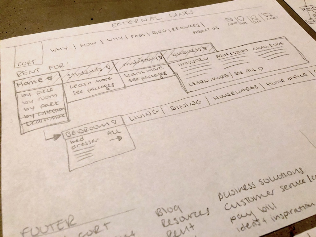
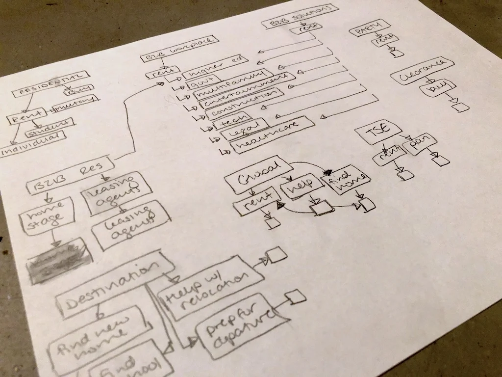
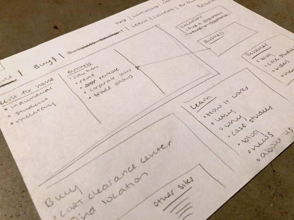
Sketches
I brainstormed content organization and sketched out lo-fi wireframes to discuss with my team before moving to medium fidelity mockups, and eventually hi-fi interactive mockups.
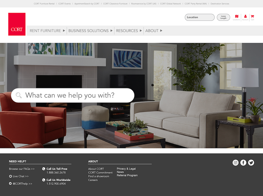
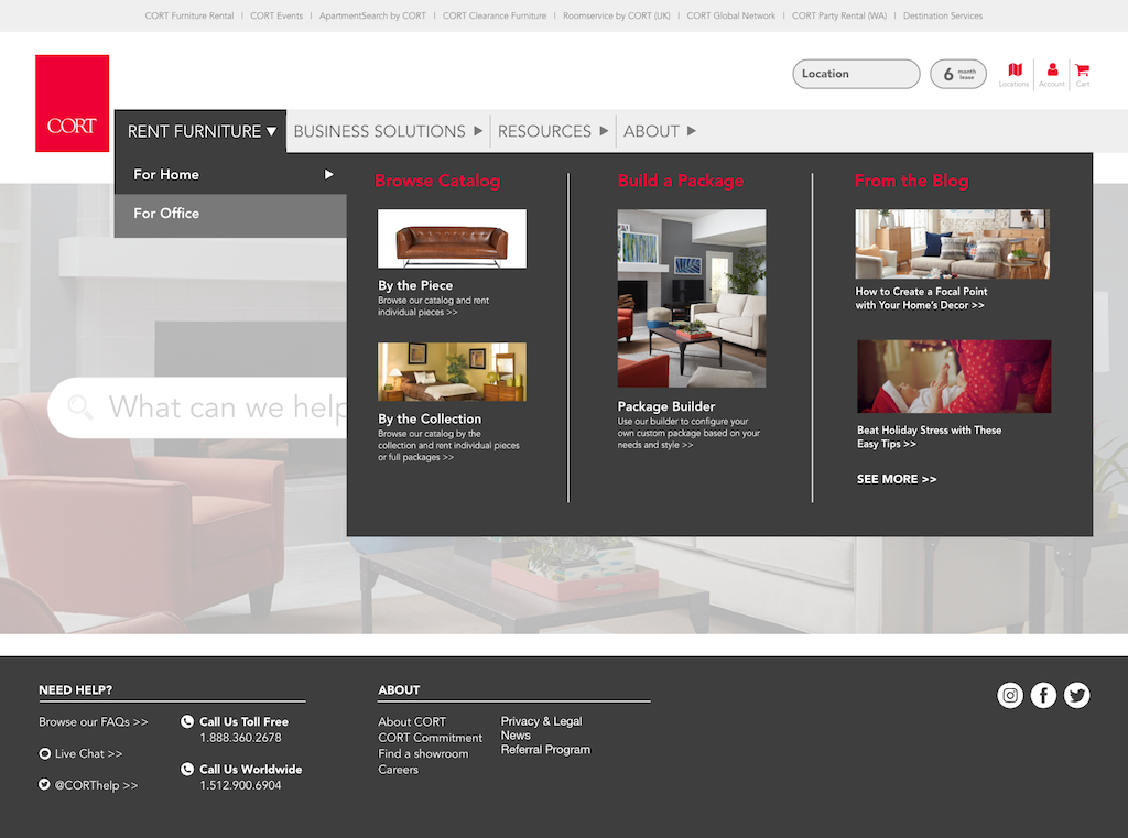
Mockups
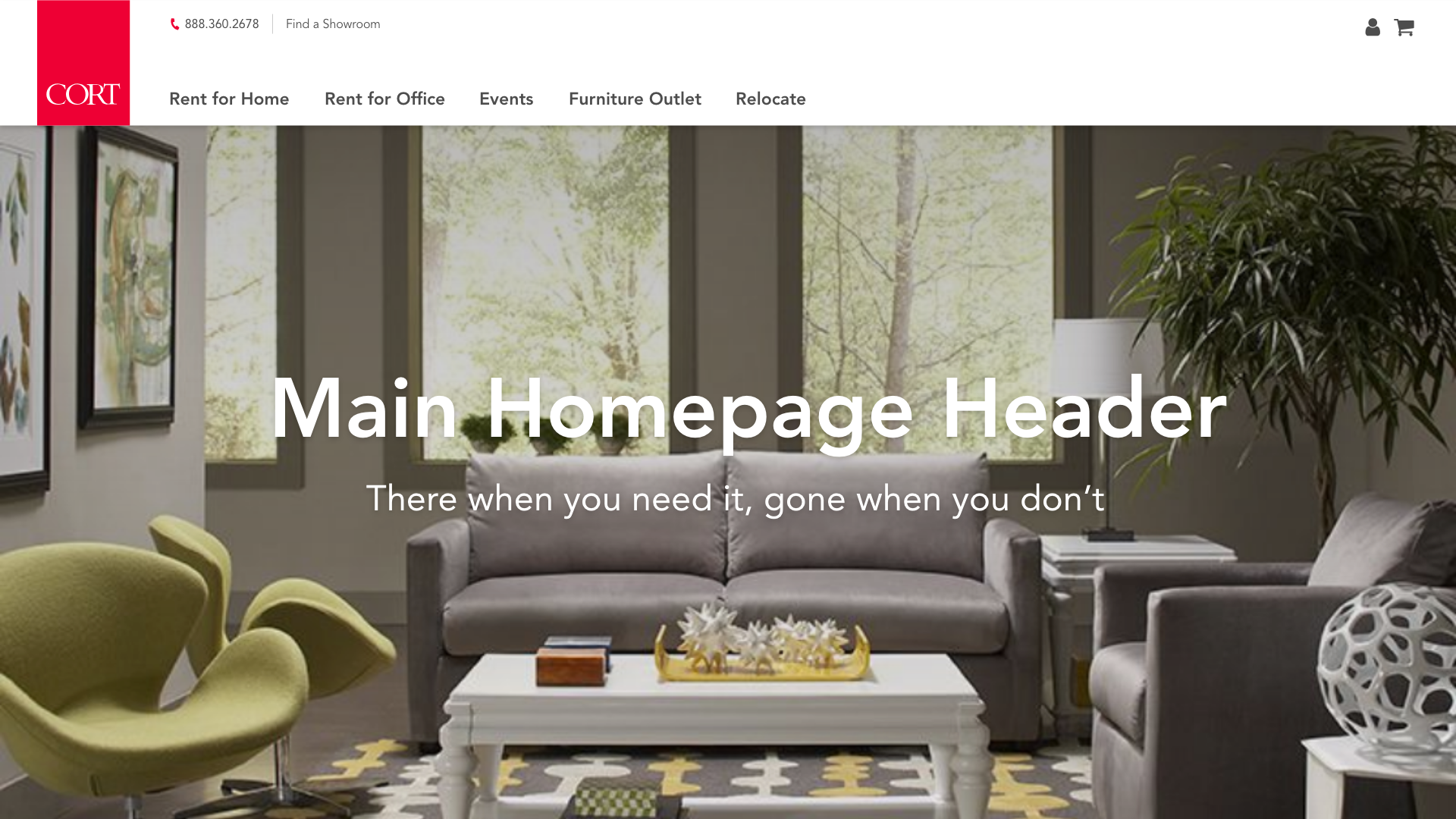
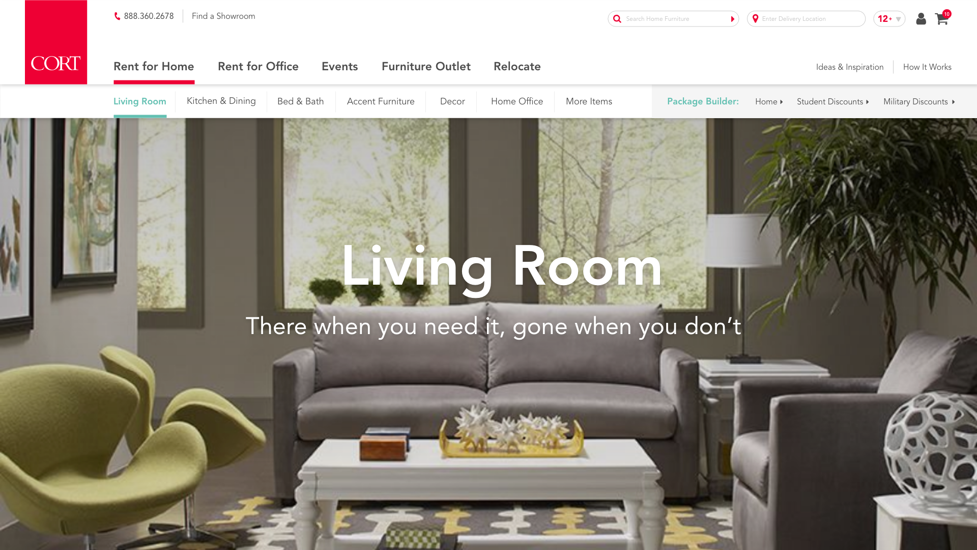
I translated the sketches into wireframe concepts, then we narrowed down and continued with mockups. Here are some initial hi-fi mockups and ideas for organization of the global nav. We eventually overhauled these and began the process again, after working with the executives to revisit business needs.
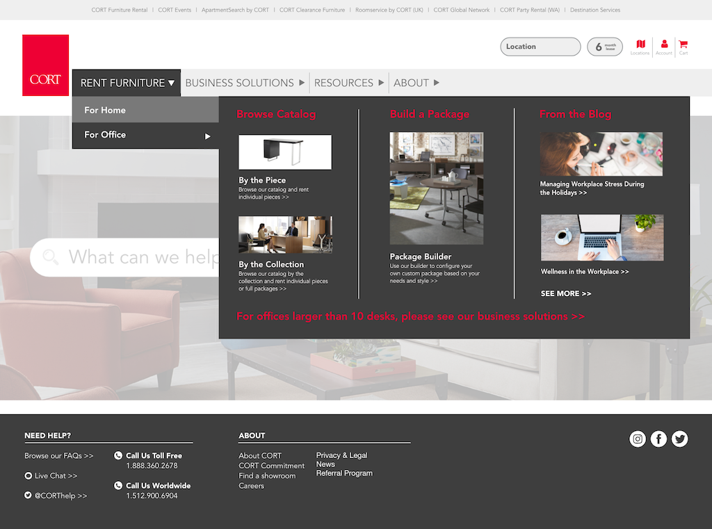
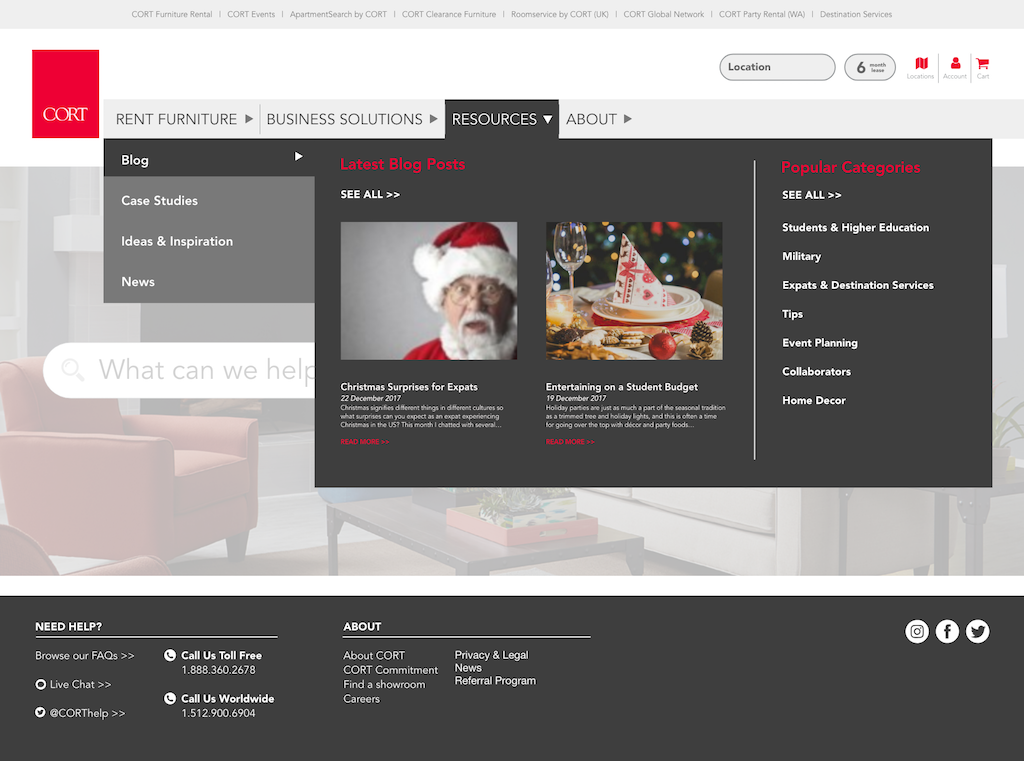
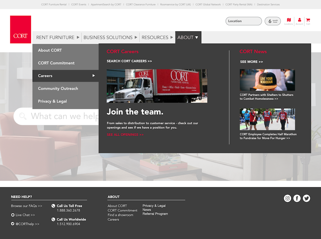
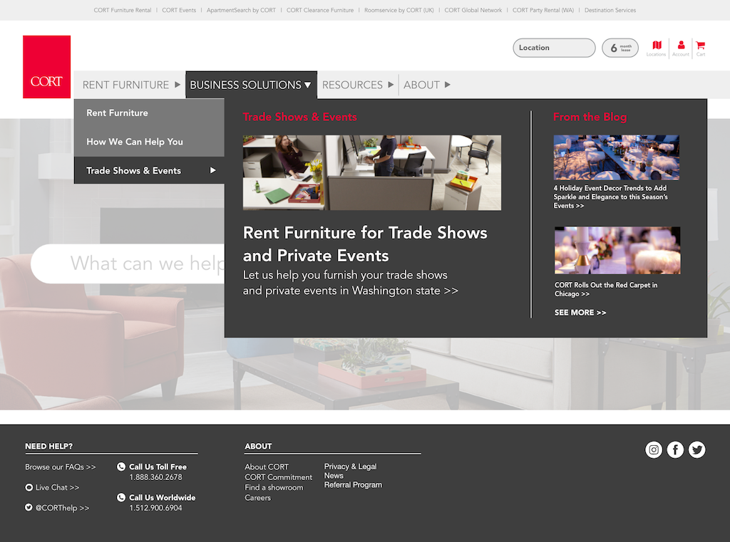
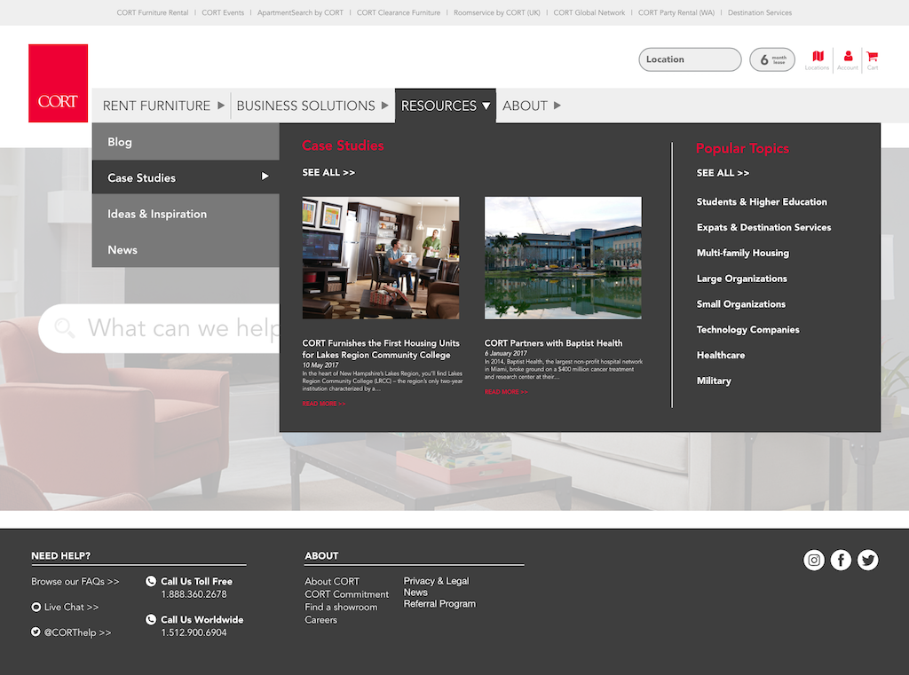
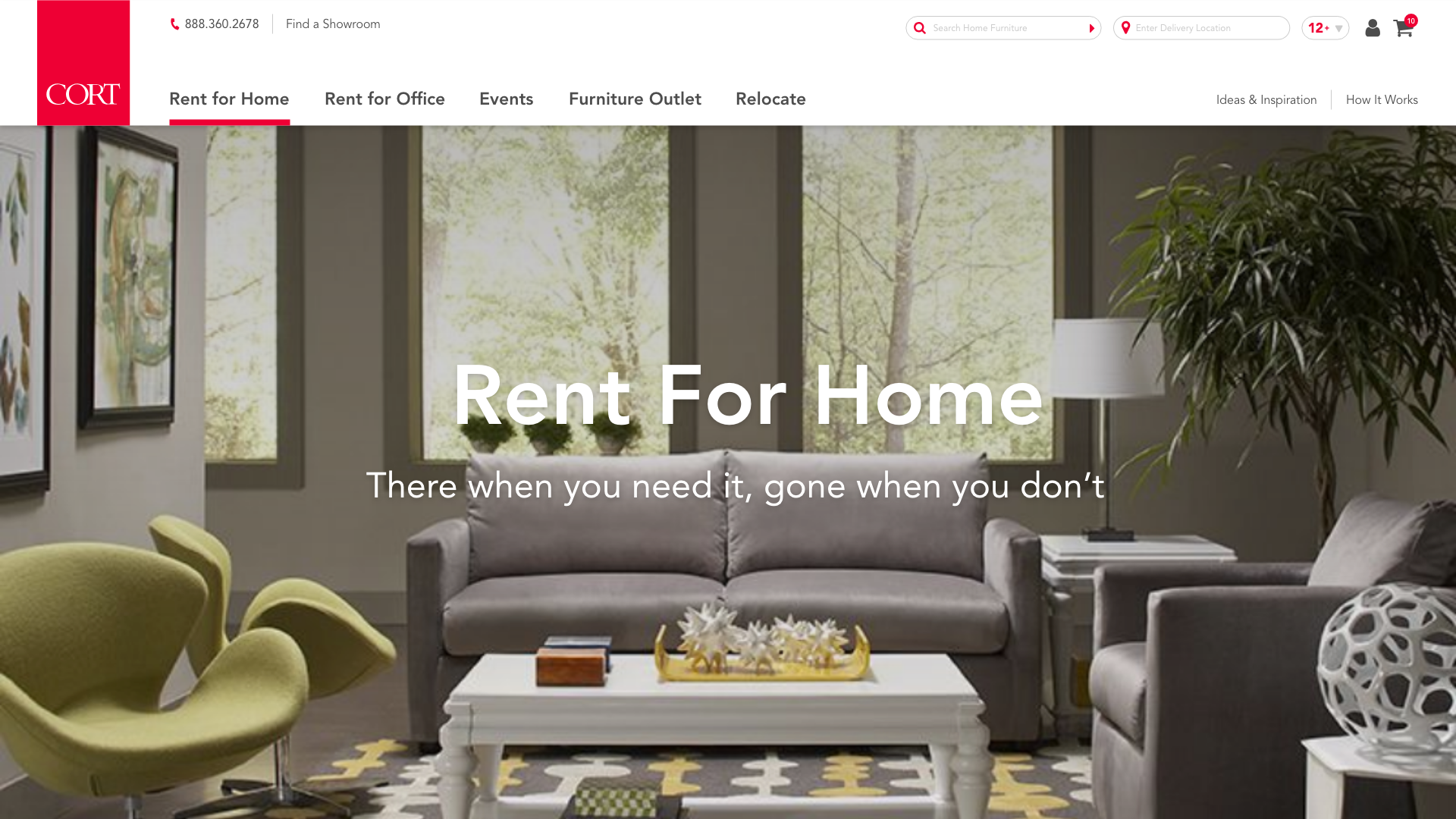
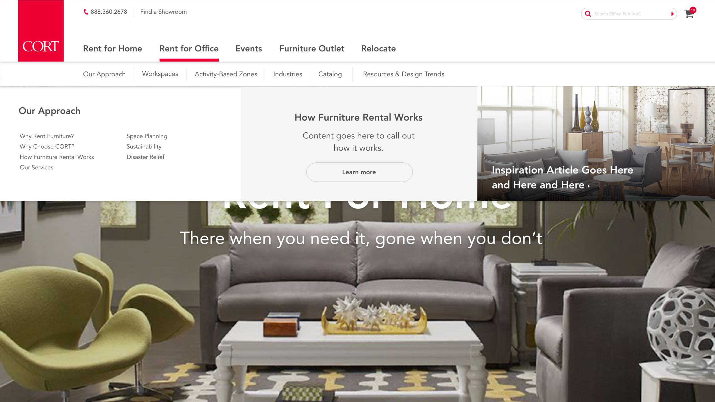
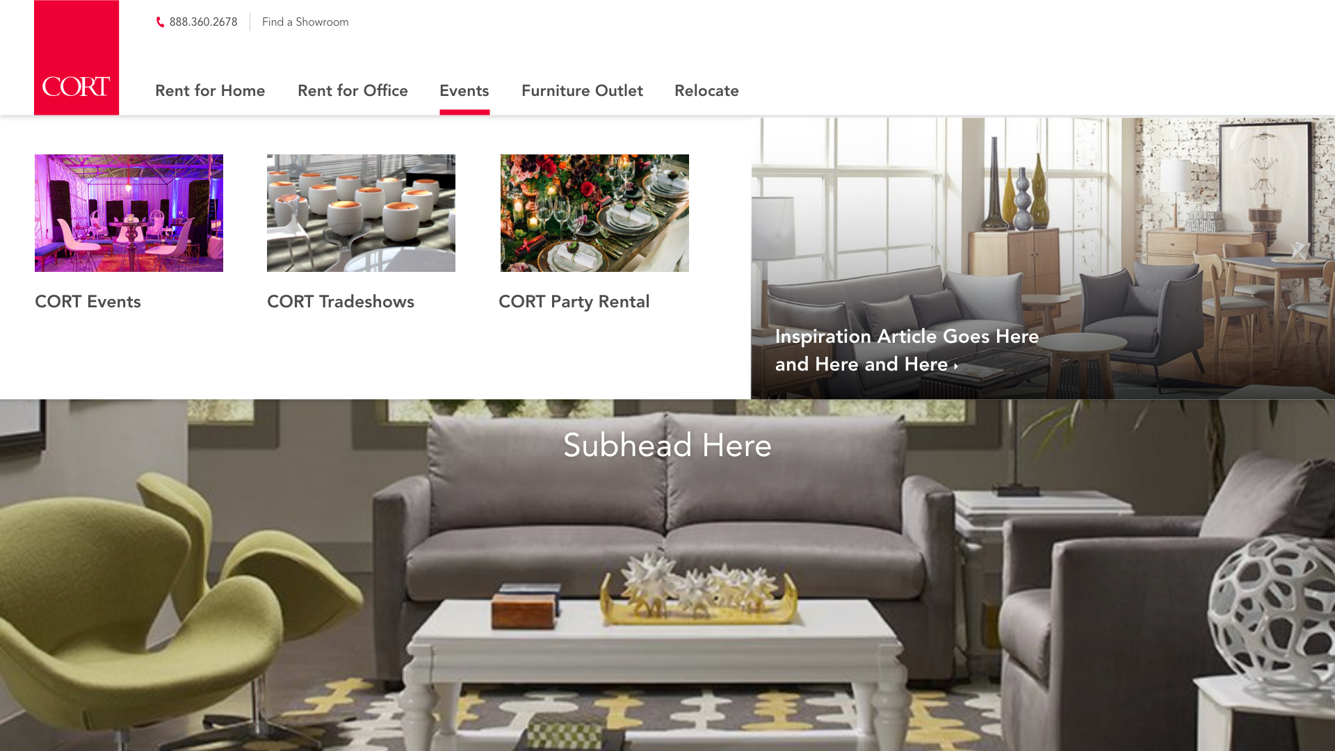
After some iterations, we continued to designs like the following (we still iterated after this and landed on a different design and organization).
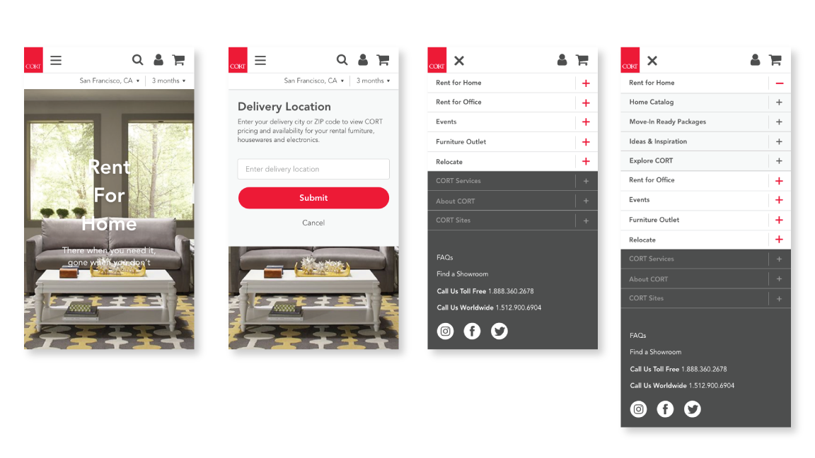
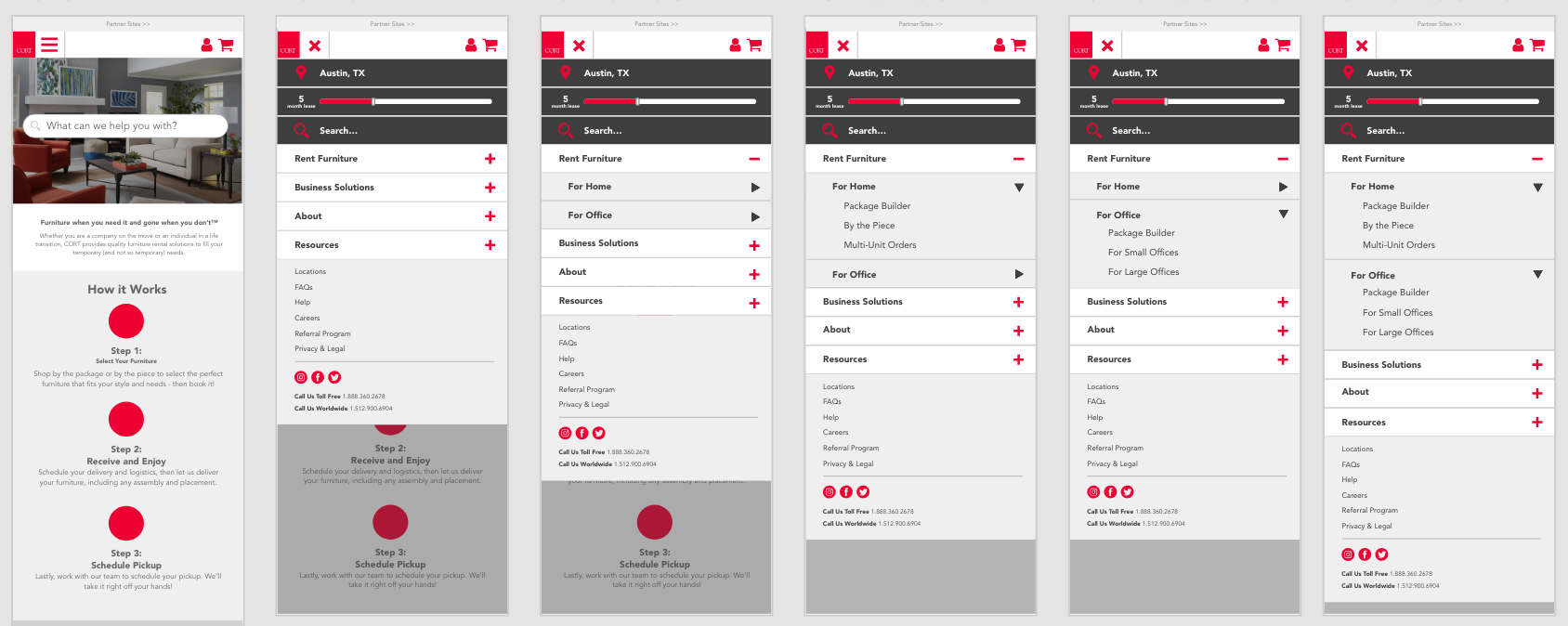
Here are some mockups for how the above nav could look on small mobile devices. We keep the main text but cut out the visual content.
My Last Contribution and Beyond
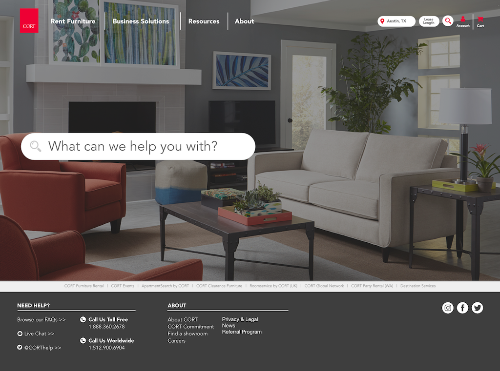
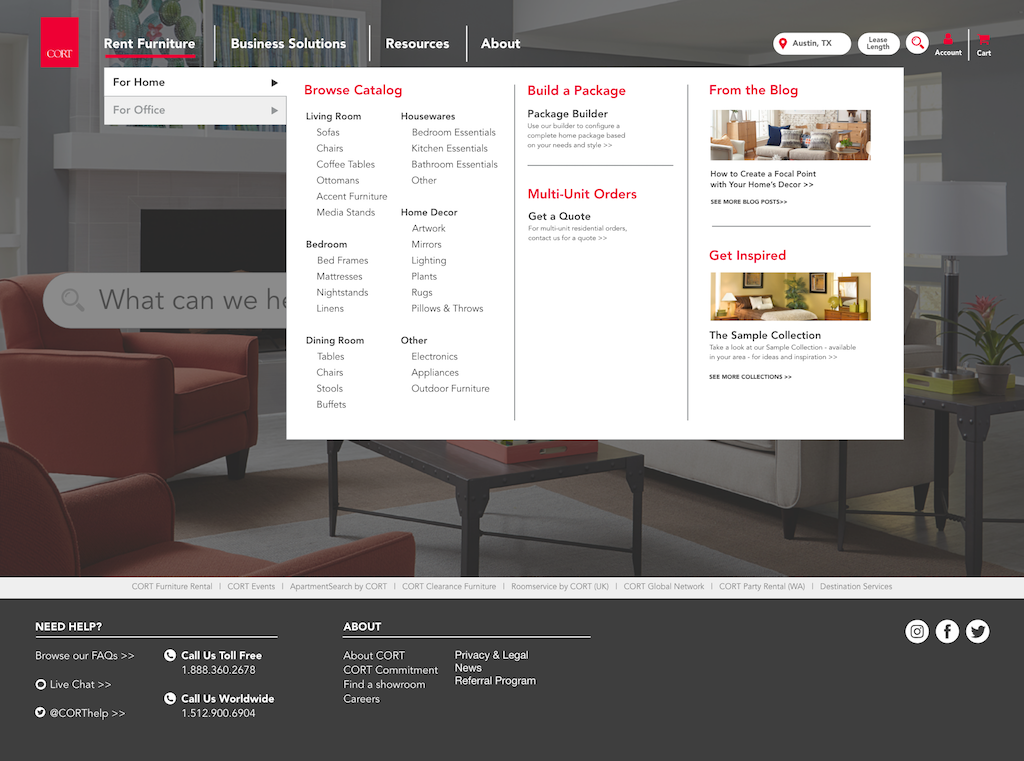
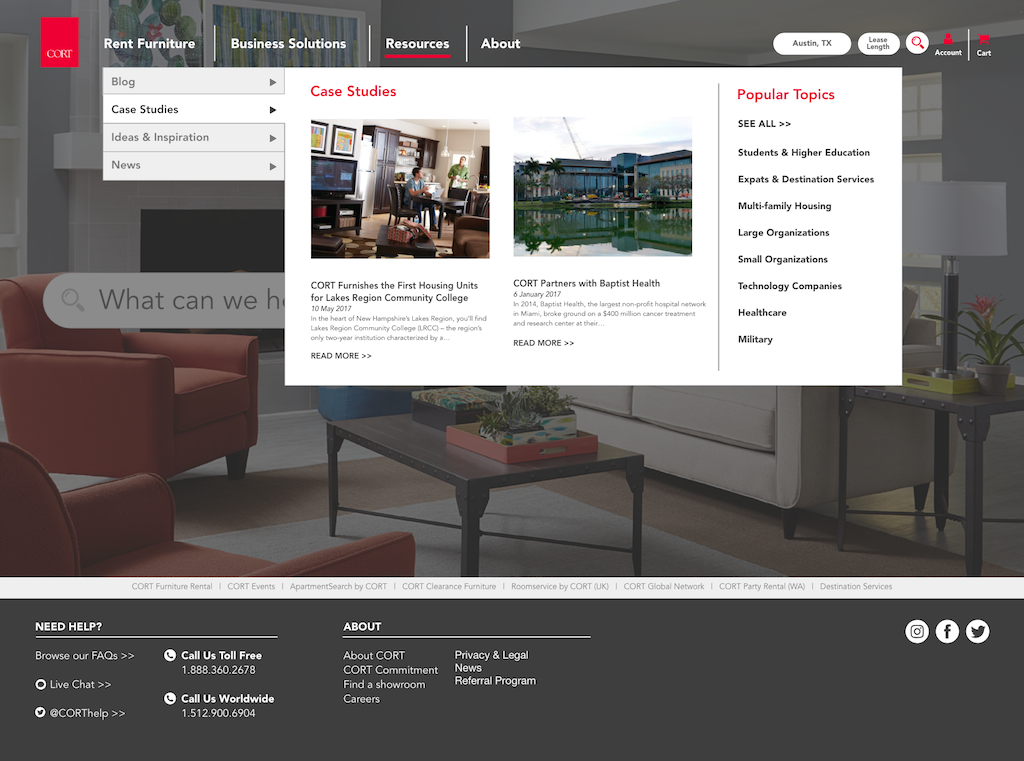
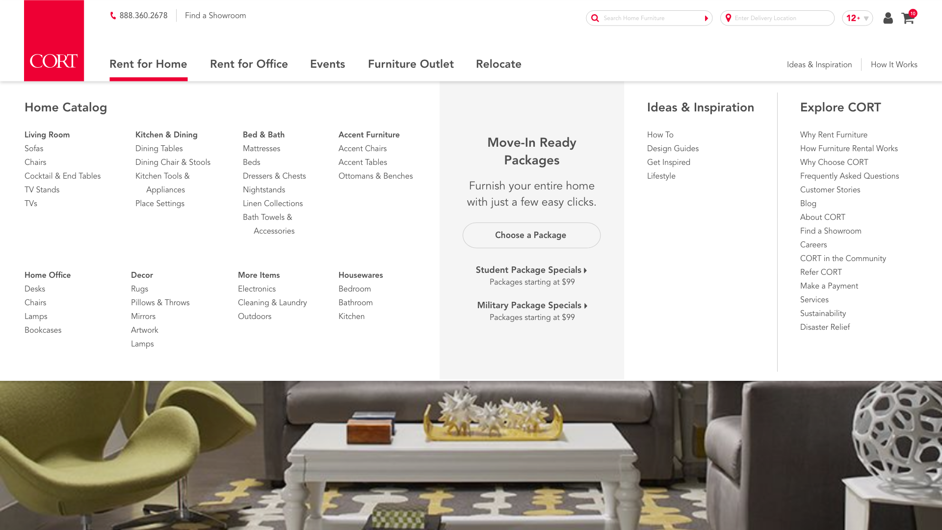
I continued to revise the navigation designs — both desktop and mobile — with team collaboration. We went through various design directions, eventually settling on a much lighter color scheme rather than the initial dark, full bleed scheme we were exploring. We did go with having the navigation change based on which page the user was on, and if they were logged in or not. This was the result of many iterations of content organization and information architecture. We also designed the nav in various break sizes, such as large desktop, laptop, tablet and smartphone.
See examples of my final designs below.
Since my collaboration with CORT, their internal team took over the design and development of the site. You can see the final version live on the site here. It’s relatively similar to that I designed.
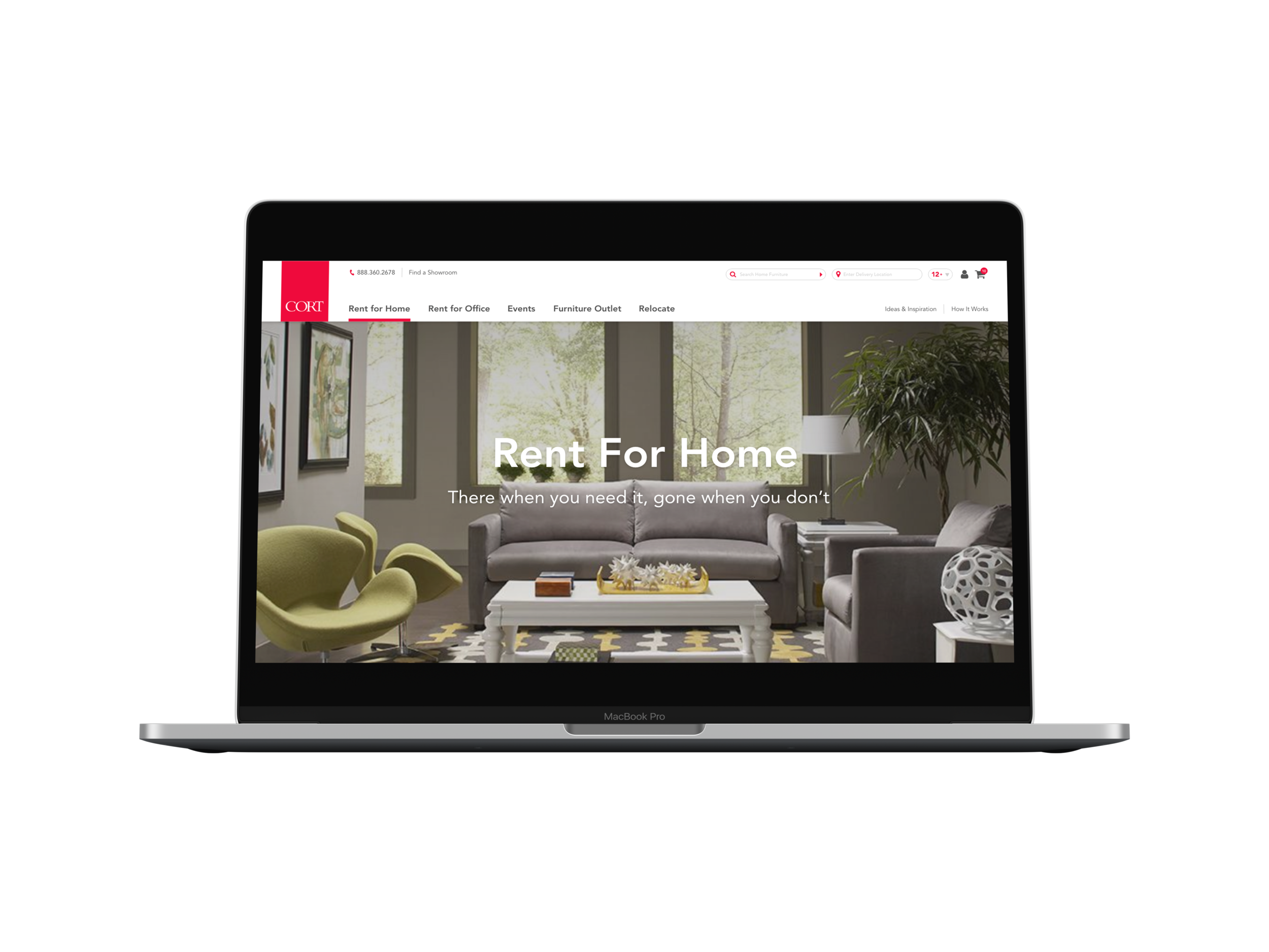
Desktop:
Mobile: