Organizing and designing personalized homepage modules for new ecommerce experience
Client
CORT Furniture Rental (a Berkshire Hathaway company)
Role
UX/UI Designer
Skills
Collaboration with Online Business Development team, including project manager, CTO, designers, developers
Sketching
Low-fidelity wireframes
High-fidelity mockups
Rapid iteration
Content organization and information architecture
2017 - 2018
Overview
Objective
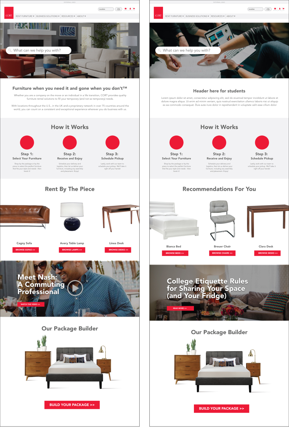
CORT is a furniture rental company that was building an entirely new ecommerce experience. I was tasked to design a number of modules that could be developed and reused across the website for different purposes; to make it easier for the development team to implement. For the homepage in particular, these modules would have to be able to be customized per the visitor. I was to create examples for an unknown individual, an enterprising individual, a student, and a B2B customer.
Context
We were moving to a new website platform that was module-based and had limited development resources. This example is the use of modules throughout the website homepage.
Outcome
I wireframed many different types of modules that could be used across the site and designed examples for each; I documented these modules for development and future designers to use. We did not have the bandwidth to develop and execute modules customized per visitor, however, so that was not included at launch.
Problem
CORT has many business segments and different audiences (students, military families, general consumers, businesses, and more). When a specific customer visits the homepage, they may be overwhelmed with all the content and messaging, and not know where to gather information tailored to them.
Purpose
The goal was to create website pages that are personalized for the user to help increase conversion rates and bring the most relevant information to the forefront. If we know who the user is, we can customize and personalize their content. Each type of module would be the same for each user, but the actual content within the module would be personalized.
Sketches
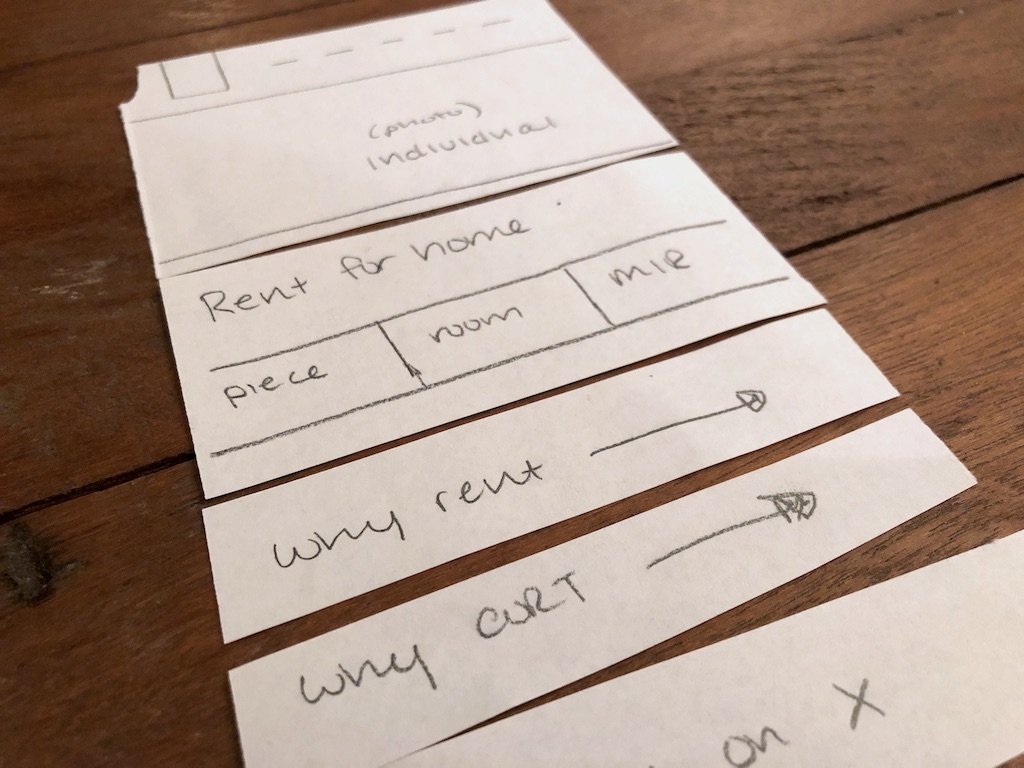
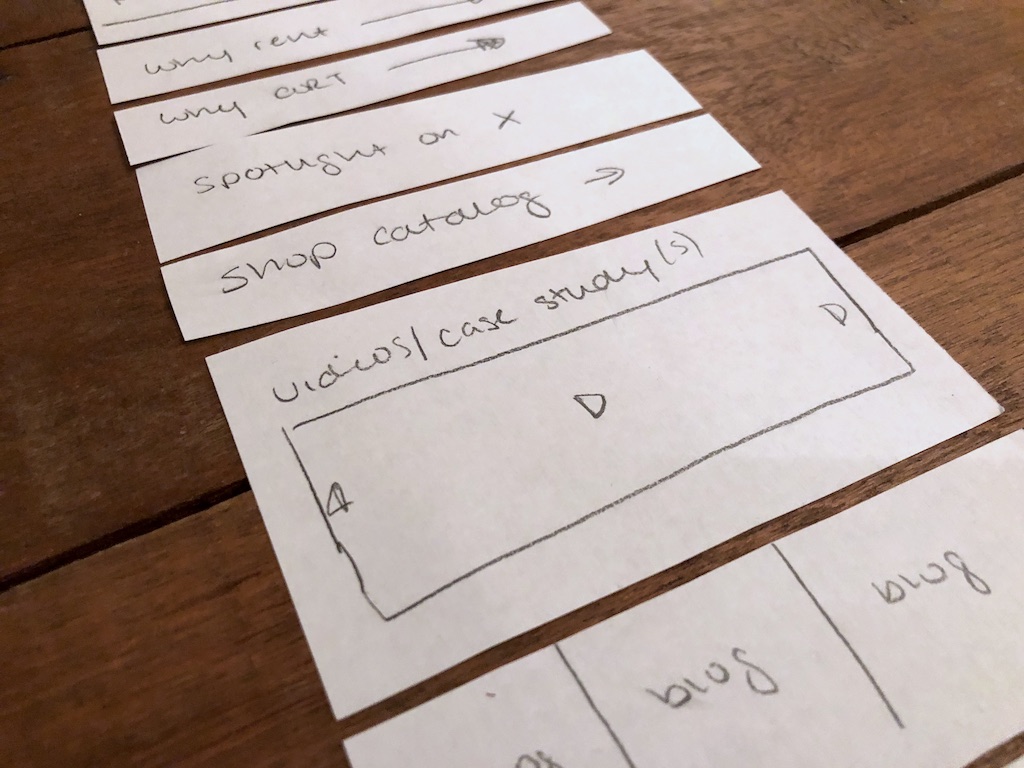
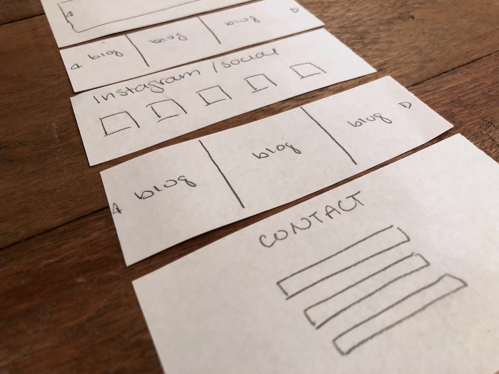
I cut from paper different types of modules to arrange and brainstorm what would work best for our users.
Wireframes
Based on the paper modules, I created multiple iterations of lo-fi digital wireframes for team review.
Mockups
Next up were hi-fi mockups. Based on team feedback and brainstorm sessions, I simplified the number of modules and types of content. These examples are all for a homepage visitor, though one is an unknown persona and the other is a student.
My Last Contribution and Beyond
I continued to revise the homepage designs based on business decisions and product manager guidance. For instance, we needed to include CORT Events and other business units on the main homepage, and we reduced the need for personalization. In the end, the overall purpose and functionality of the homepage shifted. We were no longer going to customize the modules.
Below is one of my final design concepts for the homepage.
Since my collaboration with CORT, their internal team took over the design and development of the homepage. You can see the final version live on the site here. You’ll notice they ended up shifting the design and direction.
